 |
In the field of digital design, the terms UI and UX are among the most used, often interchangeably. Yet, UI (User Interface) and UX (User Experience) are two very distinct concepts, with different roles and responsibilities, even if they are closely intertwined.
Understanding in depth what they mean, how they differ and how they should work together is essential for anyone working in the design of websites, mobile applications, software or any type of digital product.
User Experience (UX): the experience that guides every interaction
UX, or user experience, concerns everything a person experiences when interacting with a product or service. It’s not just about “using” an interface, but about how they feel while using it, how easily they achieve their goals, how satisfied they are or frustrated by the path that is proposed to them.
Imagine having to book a flight online: a good UX allows you to quickly search for the destination, choose the flights, add luggage, enter the data and pay in a few minutes, with clear instructions and no doubts. A bad UX, on the other hand, forces you to search for information for a long time, make a thousand clicks, maybe having to repeat the process because something was not reported correctly.
UX is a deep process, which starts from user research, continues in information structuring, in logical organization of flows, and arrives at validation through usability tests. The work of a UX designer is largely invisible to the end user, but is fully reflected in the effectiveness of the product.
 |
One of the main challenges of UX is avoiding unnecessary friction: ambiguous texts, repetitive steps, unclear buttons or paths that force the user to go back. A good example of UX is an e-commerce site that allows you to quickly filter products, view reviews, choose a size and complete the order with a few clicks.
A classic mistake, however, is to propose too many features all at once, without giving priority or guidance. Another pitfall is forgetting feedback: if after clicking "Confirm order" nothing happens, the user remains in doubt. The experience must always be guided, consistent, and transparent.
✅ The goal of UX
-
Understanding user needs
-
Simplifying paths (e.g. purchase, registration, navigation)
-
Make actions fluid and intuitive
-
Avoid frustration, confusion or wasted time
🔍 Typical activities of a UX Designer:
-
User Research (interviews, surveys, behavior analysis)
-
Personas (typical user profiles)
-
User Journey Mapping (map of the actions a user takes)
-
Wireframes and low-fidelity prototypes
-
Usability testing on products under development
❌ What is wrong with UX
-
Adding too many features without hierarchy
-
Making the user click 5 times to perform a simple action
-
Using technical or ambiguous terms in buttons
-
Not providing feedback after an action (e.g. “Order sent successfully”)
✅ What is the right thing to do
-
Use simple, linear flows
-
Show the steps clearly
-
Adapt the language to the target
-
Test every choice with real users
User Interface (UI): the aesthetics of interaction
If UX is the soul of the experience, UI – User Interface – is its body. We are talking about the visual and interactive part of the application or site: buttons, icons, colors, fonts, spacing, animations. In other words, everything a user sees on the screen and can interact with.
A good interface design is immediately recognizable: coherent elements, clearly visible and easily clickable buttons, harmonious use of colors, legible typography, intuitive icons. A good UI must make the right choices evident and minimize the possibility of error.
 |
The work of a UI designer is not limited to graphics in themselves: their aim is to create a clear visual language that communicates priorities, relationships between elements and interactions. A button must look like a button, a text field must be easily identifiable, an error must be effectively visually signaled.
Common errors in UI include the use of colors that are too similar between background and text (making everything unreadable), buttons that are too small for mobile use, or inconsistency between pages, which disorients the user. Aesthetics also play a role: a poorly designed interface can convey the idea of an unreliable product.
✅ The goal of the UI:
-
Make the interaction visually understandable
-
Convey visual consistency and brand identity
-
Guiding the user's eye
-
Optimize accessibility and usability
🎯 Typical activities of a UI Designer:
-
Creating design system and style guide
-
Choosing colors, fonts, icons, buttons
-
Creating High-fidelity prototypes
-
Collaborating with the development team for the final graphic rendering
❌ What is wrong with UI
-
Using hard-to-read colors (e.g. gray text on a white background)
-
Putting buttons too small to click on mobile
-
Mixing too many styles, fonts and spacing
-
Ignoring accessibility rules (e.g. contrast, alt text)
✅ What is the right thing to do
-
Use clear visual hierarchy (headings, subheadings, paragraphs)
-
Maintain consistency across screens
-
Follow design principles such as spacing, contrast, alignment
-
Apply shared design systems (e.g. Material Design, Apple HIG)
UX and UI: two distinct roles, one goal
Although closely related, UI and UX are two different fields. The UX designer deals with how a product works and how it behavesto the user inside it, while the UI designer takes care of how that product looks. One designs the flow, the other the aesthetics.
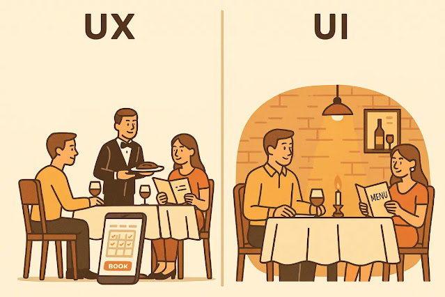
A classic metaphor: think of a restaurant. The UX is everything about the organization of the service: the ease with which you book a table, the speed with which you are served, the clarity of the menu, the overall satisfaction. The UI, on the other hand, is the furniture, the dishes, the lighting, the look of the menu. A fancy but slow and disorganized restaurant does not offer a good experience, just as a well-organized but unpleasant to look at place struggles to retain customers.
 |
🧩 Main differences between UX and UI
| Appearance | UX (User Experience) | UI (User Interface) |
|---|---|---|
| What it concerns | The user path | The visual aspect of the product |
| Objective | Ease, functionality, satisfaction | Beauty, visual clarity, consistency |
| Type of work | Strategic, analytical, behavioral | Visual, aesthetic, graphical |
| Tools used | Figma, Miro, Notion, Maze, Google Forms (for testing) | Figma, Adobe XD, Sketch, Illustrator |
| Output | Wireframes, user journeys, logical flows | Visual layouts, components, prototypes visual |
| Can it exist alone? | Yes (e.g. a good UX on a telephone service) | No, without UX it makes no sense |
Practical example: a flight booking site
A concrete example to understand the difference between a good and a bad UX/UI is a flight booking site. Suppose the user wants to search for a flight from Milan to Paris.
In the negative case, the homepage is a mess of flashing offers, the search bar is small and confusing, the fields for entering dates don't work well, and the prices aren't clear. After finding a flight, the user finds themselves having to enter personal information on five different screens, without ever knowing where they are in the process.
In the positive case, however, the homepage is focused on the search: few, clear elements, with visible calls-to-action. Flight selection is simple, filters are accessible and the user is guided step by step until payment, with visual and textual indications at each stage.
 |
Conclusion: the power of balance between form and function
In Ultimately, UI and UX are like two sides of the same coin. One doesn't work without the other. A beautiful graphical interface (UI) can't save a poorly designed user experience (UX), just as a good UX risks being wasted if the interface is unpleasant, difficult to understand or navigate.
The best digital design comes from aclose collaboration between UX and UI, where functionality is served by a coherent aesthetic, and where every detail – from micro-text to animation – is designed to improve the user journey.
Follow me #techelopment
Official site: www.techelopment.it
facebook: Techelopment
instagram: @techelopment
X: techelopment
Bluesky: @techelopment
telegram: @techelopment_channel
whatsapp: Techelopment
youtube: @techelopment


